
In the last few posts, we have been talking about lawn signs and how they can help your business. Today we are going to give you some more success tips for landscaping lawn signs to make them more visible.
Keep Your Landscaping Lawn Signs Legible & Visible
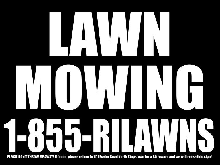
Less is more when it comes to a sign. When you keep the message short, the sign si much easier to read and see with just a glance. Signs are available in every size and shape, so you want to be sure that you‘ve selected a size that’s appropriate for that distance that your display or sign to be looked at from. Think about where you are going to place it and the obstacles that could be blocking it. It’s essential first and foremost that your sign is visible.
Avoid Having Cluttered Landscaping Lawn Signs
A successful sign will communicate your message. Your message needs to be conveyed without a lot of extra words. Crowding the sign with a lot of text lines or words will make it more difficult to read it from further away.
White space’s that area in the design that’s left uncovered either by graphics or text. It’s important to note that this can be any color you choose. That empty space that surrounds the graphics and text is equally as essential as those other considerations in the design. A lot of people want to fill up that available space with a lot of copy. However, when you have crowded text, it’s going to be a lot harder for people to read. 30-40% of the face area of your sign needs to be left as this white space to provide optimal readability.
Be Careful with Fonts & Type in Landscaping Lawn Signs
This is something that we covered in our last post. However, we thought it bore repeating. Most of the professional fonts have different weights, and this ranges from regular weight to bold, extended, black, etc. These can be used to your business’s advantage when you give preference or priority to particular message parts.
There’s a common misconception that when you capitalize letters they’re bigger than the lower case ones, they’re much easier for people to read from far away. However, this isn’t the case. It’s been shown that using a combination of text in upper case and lower case is a lot easier to read when compared with using letters in all upper case. Since most people only have three or so seconds to read the message, using a combination of letter cases is a better idea.
Generally, it’s best to only use two various fonts in your design. When you choose two complementary fonts, it can help with making the message easier for people to read. You also want to use fonts that are very easy to read even from far away.
Be Careful with Images & Graphics in Lawn Signs
Putting a border also can help with increasing the speed with which someone reads the sign by as much as 25%. When your audience is automobile traffic, it’s a good idea to use borders. A border will generally cause someone’s eyes to put their focus on your message. Additionally, full-color digital photographs can be put into your design to give you greater impact. Artwork, logos, and other kinds of graphical elements are also be added for visually enhancing your layout and design.
Choose Foreground & Background Color Carefully in Lawn Signs
When you are choosing your design’s background color, you shouldn’t use anything that is going to make it hard to put a focus on your main message. If you have a light color, black is going to contrast well with it, either in your background or in the foreground.
When the contrast is great, you are going to make your text a lot more legible. When you choose colors that are close to one another on a color wheel, the sign is not going to be very clear until the person’s right on it.
Various Color Combinations & Their Visibility
Below are 15 combinations that are visible when far away. The number one spot is most legible, and the number 15 spot is least legible.
- Black letters on a yellow background
- Black letters on a white background
- Yellow letters on a black background
- White letters on a blue background
- Green letters on a white background
- Blue letters on a yellow background
- White letters on a green background
- Brown letters on a yellow background
- Brown letters on a white background
- Yellow letters on a brown background
- Red letters on a white background
- Yellow letters on a red background
- Red letters on a yellow background
- White letters on a red background
When you follow these above guidelines, it will help with ensuring the sign’s readable by the people you are targeting.
These are some tips that you can use to help your landscaping lawn signs be successful. It’s also a good idea to find a good place to purchase your signs from. We work with UZ Marketing. Check out their site here.