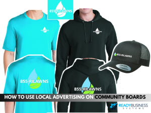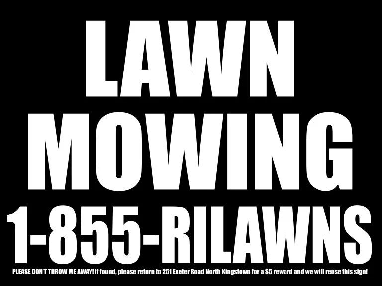

Yard signs are one of the best things that you can use to advertise your local business. But you also have to be careful to make sure that you have the right font on your signs. Below is a short guide to the best fonts for business yard signs.
Best Fonts for Business Yard Signs
A lot of people have listed out the characters that are good for designing signs. However, below are some of the best sign fonts that can be used for signs.
- Avenir
- Bebas
- Bodoni
- Didot
- Frutiger
- Futura
- Garamond
- Helvetica
- Proxima Nova
- Verdana
The fonts above are some good fonts that you want to use when you are creating a sign. Even though they’re great characters, it doesn’t always mean that the lettering that was chosen by you isn’t good. To want to make sure that the letters that are being used should be suiting your needs. So, how is it possible to know that the characters are going to suit the sign? We’ll look at that next.
How Do You Know Your Typeface is Good for Business Yard Signs
There are a few things that will make a typeface a great choice is that they’re balanced, consistent, even kerned, and legible. These are all features that a good typeface has.
Balance:
A great typeface has a balance of light and heavy, thin and thick. Two good examples of styles are Bodoni and Didot.
Consistency
Great typefaces have to look the same, and we call this consistency. This means that all of the symbols, numbers, letters, and any of the other characters are going to look alike. If the letter A has serifs, B also should have Serifs. If this isn’t the case, the typeface is incomplete and inconsistent.
Even Kerning
You may not know what kerning is. This is simply the amount of space between letters. If the range’s too small, that typeface is unreadable. However, if that space’s too large, it’s harder to read text. That’s why it’s essential to have even kerning in a sign.
Legibility
Finally, the typeface needs to be legible. If you aren’t able to properly see and read a text, it’s not legible. Three great examples of characters that are legible are Garamond, Helvetica, and Sans Serif.
These are some of the things that you want to remember when you are creating lawn signs for your business. After all, you want to make sure that people who see your sign are able to read them. Otherwise, you are wasting a lot of time and money having them made. If people aren’t able to read your yard signs advertising your business, you may as well have put blank pieces of paper out there.
Are you interested in using yard signs for your business? If so, we work with UZ marketing ourselves, and they have a variety of sizes of yard signs that you can choose from. Click here to find out more about what they have to offer.